TechDocs Addons
This documentation is written for the new frontend system. If you are on the old frontend system you may want to read its own article instead.
Concepts
TechDocs is a centralized platform for publishing, viewing, and discovering technical documentation across an entire organization. It's a solid foundation! But it doesn't solve higher-order documentation needs on its own: how do you create and reinforce a culture of documentation? How do you build trust in the quality of technical documentation?
TechDocs Addons are a mechanism by which you can customize the TechDocs experience in order to try and address some of these higher-order needs.
Addons
An Addon is just a react component. Like any react component, it can retrieve and render data using normal Backstage or native hooks, APIs, and components. Props can be used to configure its behavior, where appropriate.
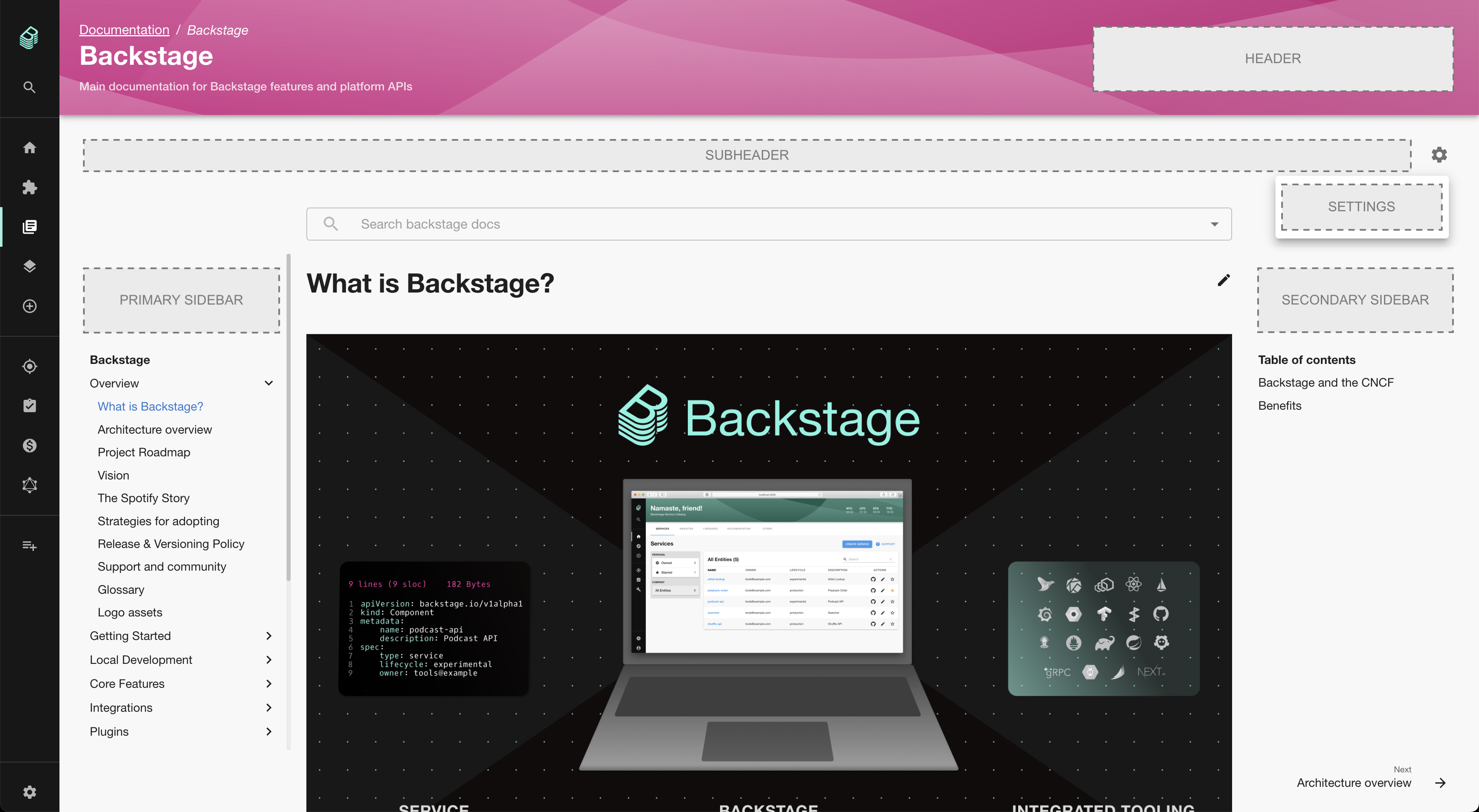
Locations
Addons declare a location where they will be rendered. Most locations are
representative of physical spaces in the TechDocs UI:
Header: For Addons which fill up the header from the right, on the same line as the title.Subheader: For Addons that sit below the header but above all content. This is a great location for tooling/configuration of TechDocs display.Settings: These addons are items added to the settings menu list and are designed to make the reader experience customizable, for example accessibility options.PrimarySidebar: Left of the content, above of the navigation.SecondarySidebar: Right of the content, above the table of contents.Content: A special location intended for Addons which augment the statically generated content of the documentation itself.Component: A proposed-but-not-yet-implemented virtual location, aimed at simplifying a common type of Addon.
Addon Registry
The installation and configuration of Addons happens within a Backstage app's frontend. Addons are imported from plugins and registered as a plugin extension which are configured for both the TechDocs Reader page as well as the Entity docs page.
Addons are rendered in the order in which they are registered.
Installing and using Addons
To start using Addons you need to add the @backstage/plugin-techdocs-module-addons-contrib package to your app. You can do that by running this command from the root of your project: yarn --cwd packages/app add @backstage/plugin-techdocs-module-addons-contrib
Addons can then be installed as a module in your App.tsx:
// packages/app/src/App.tsx

import { createApp } from '@backstage/frontend-defaults';
import { createFrontendModule } from '@backstage/frontend-plugin-api';
import { techDocsReportIssueAddonModule } from '@backstage/plugin-techdocs-module-addons-contrib/alpha';

// ...

const app = createApp({
  features: [
    // ...
    techDocsReportIssueAddonModule,
    // ...other techdocs addon modules
  ],
});

export default app.createRoot();
Note that on the entity page, because the Catalog plugin is responsible for the
page header, TechDocs Addons whose location is Header will not be rendered.
Available Addons
Addons can, in principle, be provided by any plugin! To make it easier to discover available Addons, we've compiled a list of them here:
| Addon | Package/Plugin | Description |
|---|---|---|
techDocsExpandableNavigationAddonModule | @backstage/plugin-techdocs-module-addons-contrib/alpha | Allows TechDocs users to expand or collapse the entire TechDocs main navigation, and keeps the user's preferred state between documentation sites. |
techDocsReportIssueAddonModule | @backstage/plugin-techdocs-module-addons-contrib/alpha | Allows TechDocs users to select a portion of text on a TechDocs page and open an issue against the repository that contains the documentation, populating the issue description with the selected text according to a configurable template. |
techDocsTextSizeAddonModule | @backstage/plugin-techdocs-module-addons-contrib/alpha | This TechDocs addon allows users to customize text size on documentation pages, they can select how much they want to increase or decrease the font size via slider or buttons. The default value for font size is 100% and this setting is kept in the browser's local storage whenever it is changed. |
techDocsLightBoxAddonModule | @backstage/plugin-techdocs-module-addons-contrib/alpha | This TechDocs addon allows users to open images in a light-box on documentation pages, they can navigate between images if there are several on one page. The image size of the light-box image is the same as the image size on the document page. When clicking on the zoom icon it zooms the image to fit in the screen (similar to background-size: contain). Images inside links are ignored to avoid blocking navigation. |
Got an Addon to contribute? Feel free to add a row above!
Creating an Addon
The simplest Addons are plain old react components that get rendered in specific locations within a TechDocs site. To package such a react component as an Addon, follow these steps:
- Write the component in your plugin like any other component
- Create the addon extension using the
TechDocsAddonBlueprint - Create and export the addon module from your plugin
// plugins/your-plugin/src/plugin.ts

import { TechDocsAddonLocations } from '@backstage/plugin-techdocs-react';
import { AddonBlueprint } from '@backstage/plugin-techdocs-react/alpha';
import { CatGifComponent } from './addons';
import { createFrontendModule } from '@backstage/frontend-plugin-api';

// ...

const techDocsCatGifAddon = AddonBlueprint.make({
  name: 'cat-gif',
  params: {
    name: 'CatGif',
    location: TechDocsAddonLocations.Header,
    component: CatGifComponent,
  },
});

export const techDocsCatGifAddonModule = createFrontendModule({
  pluginId: 'techdocs',
  extensions: [techDocsCatGifAddon],
});
Addons in the Content location
Beyond the "render a component in a region" use-case, it's also possible for Addons to access and manipulate a TechDocs site's DOM; this could be used to, for example, load and instantiate client-side diagramming libraries, replace elements with dynamically loaded content, etc.
This type of Addon is still expressed as a react component, but instead of
returning a react element to be rendered, it updates the DOM via side-effects
(e.g. with useEffect). Access to the DOM is made available via utility hooks
provided by the Addon framework.
// plugins/your-plugin/src/addons/MakeAllImagesCatGifs.tsx

import React, { useEffect } from 'react';
import { useShadowRootElements } from '@backstage/plugin-techdocs-react';

// This is a normal react component; in order to make it an Addon, you would
// still create and provide it via your plugin as described above. The only
// difference is that you'd set `location` to `TechDocsAddonLocations.Content`.
export const MakeAllImagesCatGifsAddon = () => {
  // This hook can be used to get references to specific elements. If you need
  // access to the whole shadow DOM, use the underlying useShadowRoot()
  // hook instead.
  const images = useShadowRootElements<HTMLImageElement>(['img']);

  useEffect(() => {
    images.forEach(img => {
      if (img.src !== 'https://example.com/cat.gif') {
        img.src = 'https://example.com/cat.gif';
      }
    });
  }, [images]);

  // Nothing to render directly, so we can just return null.
  return null;
};
Testing Addons
Install @backstage/plugin-techdocs-addons-test-utils as a devDependency in
your plugin for access to utilities that make testing such Addons easier.
A test for the above Addon might look something like this:
// plugins/your-plugin/src/addons/MakeAllImagesCatGifs.test.tsx
import { TechDocsAddonTester } from '@backstage/plugin-techdocs-addons-test-utils';

// Note: import your actual addon (the one provided by your plugin).
import { MakeAllImagesCatGifs } from '../plugin.ts';

describe('MakeAllImagesCatGifs', () => {
  it('replaces img srcs with cat gif', async () => {
    const { getByTestId } = await TechDocsAddonTester.buildAddonsInTechDocs([
      <MakeAllImagesCatGifs />,
    ])
      .withDom(<img data-testid="fixture" src="http://example.com/dog.jpg" />)
      .renderWithEffects();

    expect(getByTestId('fixture')).toHaveAttribute(
      'src',
      'https://example.com/cat.gif',
    );
  });
});