Software Template Configuration
Backstage software templates create source code, so your Backstage application needs to be set up to allow repository creation.
This is done in your app-config.yaml by adding
Backstage integrations for the
appropriate source code repository for your organization.
Integrations may already be set up as part of your app-config.yaml.
The next step is to add templates to your Backstage app.
Publishing defaults
Software templates can define publish actions, such as publish:github, to
create new repositories or submit pull / merge requests to existing
repositories. You can configure the author and commit message through the
scaffolder configuration in app-config.yaml:
scaffolder:
  defaultAuthor:
    name: M.C. Hammer # Defaults to `Scaffolder`
    email: hammer@donthurtem.com # Defaults to `scaffolder@backstage.io`
  defaultCommitMessage: "U can't touch this" # Defaults to 'Initial commit'
To configure who can see the new repositories created from software templates,
add the repoVisibility key within a software template:
- id: publish
  name: Publish
  action: publish:github
  input:
    repoUrl: '{{ parameters.repoUrl }}'
    repoVisibility: public # or 'internal' or 'private'
Default Environment
The scaffolder supports a defaultEnvironment configuration that provides default parameters and secrets to all templates. This reduces template complexity and improves security by centralizing common values.
scaffolder:
  defaultEnvironment:
    parameters:
      region: eu-west-1
      organizationName: acme-corp
      defaultRegistry: registry.acme-corp.com
    secrets:
      AWS_ACCESS_KEY: ${AWS_ACCESS_KEY}
      GITHUB_TOKEN: ${GITHUB_TOKEN}
      DOCKER_REGISTRY_TOKEN: ${DOCKER_REGISTRY_TOKEN}
Default parameters
Default parameters are accessible via ${{ environment.parameters.* }} in templates. Default parameters are isolated in their own context to avoid naming conflicts.
 parameters:
    - title: Fill in some steps
      required:
        - organizationName
      properties:
        organizationName:
          title: organizationName
          type: string
          description: Unique name of the organization
          ui:autofocus: true
          ui:options:
            rows: 5

  steps:
    - id: deploy
      name: Deploy Application
      action: aws:deploy
      input:
        region: ${{ environment.parameters.region }}  # Resolves to defaultEnvironment.parameters.region
        organization: ${{ parameters.organizationName }}  # Resolves to frontend input value
        otherOrganization: ${{ environment.parameters.organizationName }}  # Resolves to defaultEnvironment.parameters.organizationName
Secrets
Default secrets are resolved from environment variables and accessible via ${{ environment.secrets.* }} in template actions. Secrets are only available during action execution, not in frontend forms.
- id: deploy
  name: Deploy with credentials
  action: aws:deploy
  input:
    accessKey: ${{ environment.secrets.AWS_ACCESS_KEY }} # Resolves to defaultEnvironment.secrets.AWS_ACCESS_KEY
Security Note: Secrets are automatically masked in logs and are only available to backend actions, never exposed to the frontend.
Task Recovery
The scaffolder supports automatic task recovery when workers restart or crash. When enabled, tasks that were in a processing state will be recovered and can be resumed from where they left off.
scaffolder:
  taskRecovery:
    enabled: true
    staleTimeout: { seconds: 30 } # Optional, defaults to 30 seconds
When task recovery is enabled:
- Tasks in
processingstate with stale heartbeats are automatically recovered toopenstate - Secrets are preserved until the task reaches a terminal state (completed/failed)
- Completed steps are skipped on retry, resuming from the last incomplete step
- Step outputs are restored so subsequent steps can access previous results
An action can run more than once if a task is recovered or retried. This can happen when an action succeeds but workspace serialization fails, because the step is not recorded as completed until its workspace has been stored. Actions used in recoverable templates should therefore be idempotent. You can use checkpoints in custom actions to achieve this.
Workspace Serialization
By default, task recovery does not persist the task workspace (filesystem). If your tasks work with files and you want workspaces to survive restarts, you need to install a workspace provider module and configure it separately.
Workspace serialization is not enabled by default — you must explicitly opt in by setting workspaceProvider.
scaffolder:
  taskRecovery:
    enabled: true
    workspaceProvider: database # or 'gcpBucket' for GCS
Available workspace providers:
database— Stores workspaces in the database via@backstage/plugin-scaffolder-backend-module-workspace-database. Has a 50MB limit and is not recommended for production use.gcpBucket— Stores workspaces in a GCS bucket via@backstage/plugin-scaffolder-backend-module-gcp. Requires workload identity to be configured. Bucket name is configured viascaffolder.taskRecovery.gcsBucket.name.
To use a provider, install the corresponding module in your backend:
# For database storage (development only)
yarn --cwd packages/backend add @backstage/plugin-scaffolder-backend-module-workspace-database

# For GCS storage (production)
yarn --cwd packages/backend add @backstage/plugin-scaffolder-backend-module-gcp
Then add the module to your backend in packages/backend/src/index.ts:
backend.add(
  import('@backstage/plugin-scaffolder-backend-module-workspace-database'),
);
Migrating from Experimental Flags
If you were using the previous experimental configuration, the new config replaces it:
| Old (Experimental) | New |
|---|---|
scaffolder.EXPERIMENTAL_recoverTasks | scaffolder.taskRecovery.enabled |
scaffolder.EXPERIMENTAL_recoverTasksTimeout | scaffolder.taskRecovery.staleTimeout |
scaffolder.EXPERIMENTAL_workspaceSerialization | scaffolder.taskRecovery.workspaceProvider |
scaffolder.EXPERIMENTAL_workspaceSerializationProvider | scaffolder.taskRecovery.workspaceProvider |
scaffolder.EXPERIMENTAL_workspaceSerializationGcpBucketName | scaffolder.taskRecovery.gcsBucket.name |
The per-template spec.EXPERIMENTAL_recovery field is no longer required. When taskRecovery.enabled is set to true, all tasks are eligible for recovery.
The old experimental flags are still supported as fallbacks but are deprecated and will be removed in a future release. If you use EXPERIMENTAL_workspaceSerialization, install and register the corresponding workspace provider module. The database provider module migrates existing database workspace snapshots from the legacy task storage when it starts for the first time. The EXPERIMENTAL_workspaceSerializationProvider setting continues to select a provider only when EXPERIMENTAL_workspaceSerialization is set to true.
Requiring SCM user credentials
You can require that supported SCM actions only operate with credentials explicitly provided by the signed-in user:
scaffolder:
  requireScmUserCredentials: true
When enabled, supported built-in GitHub, GitLab, Bitbucket Cloud, Bitbucket
Server, and Azure DevOps mutation actions reject requests that do not include a
user-provided token. The fetch:plain, fetch:plain:file, fetch:template,
and fetch:template:file actions enforce the same requirement for GitHub and
GitLab reads. Custom actions and SCM readers that do not accept a user token
input are not affected.
The GitLab publish:gitlab action's setUserAsOwner and ownerUsername
inputs cannot be used with this setting because they require privileged
credentials from the GitLab integration.
Customizing the ScaffolderPage with Grouping and Filtering
The sections below cover the legacy (JSX) frontend system. For the new frontend system, see Customizing the templates page in the new frontend system below.
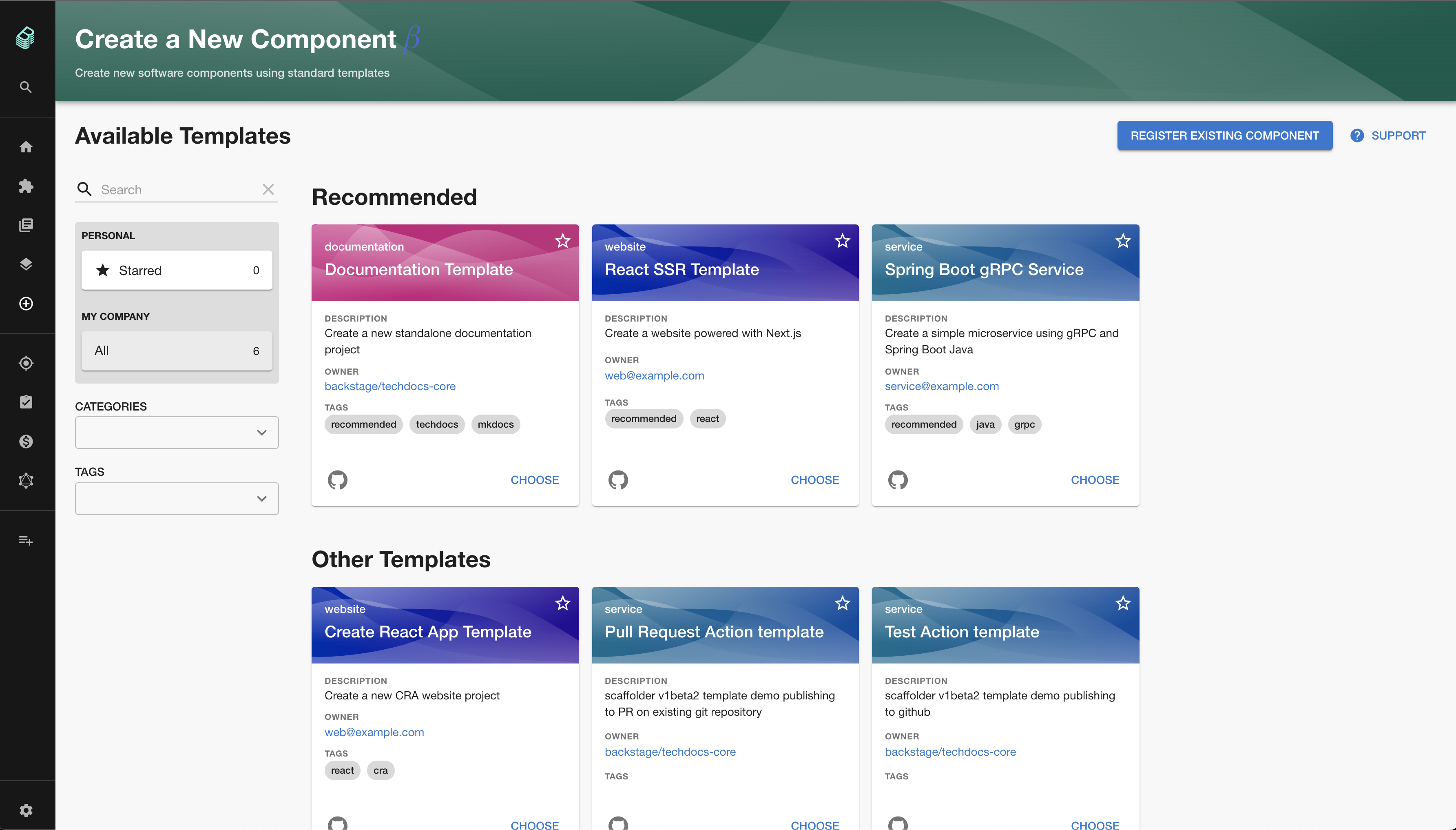
Once you have more than a few software templates you may want to customize your
ScaffolderPage by grouping and surfacing certain templates together. You can
accomplish this by creating groups and passing them to your ScaffolderPage
like below
<ScaffolderPage
  groups={[
    {
      title: 'Recommended',
      filter: entity =>
        entity?.metadata?.tags?.includes('recommended') ?? false,
    },
  ]}
/>
This code will group all templates with the 'recommended' tag together at the top of the page above any other templates not filtered by this group or others.
You can also further customize groups by passing in a titleComponent instead
of a title which will be a component to use as the header instead of just the
default ContentHeader with the title set as it's value.
There is also an option to hide some templates. You can have several use cases for that:
- it's still in an experimental phase, so you can combine it with feature flagging for example
- you don't want to make them accessible from template list, but only open it on some action with pre-filled data.
- show different set of templates depends on target environment
<ScaffolderPage
  templateFilter={entity =>
    entity?.metadata?.tags?.includes('experimental') ?? false
  }
/>
Customizing the templates page in the new frontend system
In the new frontend system the templates page is built from extensions, so customisations are configured rather than passed as JSX props.
Defining template groups in app-config.yaml
The sub-page:scaffolder/templates extension accepts a groups config field.
Each group has a title and a filter predicate (using
entity predicate queries).
Templates not matched by any group fall into an automatically appended
"Other Templates" group. With no groups configured the page renders a single
"Templates" group.
app:
  extensions:
    - sub-page:scaffolder/templates:
        config:
          groups:
            - title: Recommended Services
              filter:
                spec.type: service
            - title: Documentation
              filter:
                spec.type: documentation
Predicate values are matched case-insensitively. The matchers $exists,
$in, $contains, $hasPrefix and the logical operators $all, $any, $not
are also supported — see the
entity predicate queries reference
for the full grammar.
Filtering templates in app-config.yaml
The sub-page:scaffolder/templates extension accepts a templateFilter config
field. It is an entity predicate query
applied to every template before it is displayed. For example, exclude templates
tagged wip:
app:
  extensions:
    - sub-page:scaffolder/templates:
        config:
          templateFilter:
            $not:
              metadata.tags:
                $contains: wip
Replacing the default TemplateCard
The TemplateCard exported from @backstage/plugin-scaffolder-react/alpha
is a swappable component. Apps can replace it by registering a
SwappableComponentBlueprint extension that targets TemplateCard:
// packages/app/src/modules/appModuleScaffolder.tsx
import { createFrontendModule } from '@backstage/frontend-plugin-api';
import { SwappableComponentBlueprint } from '@backstage/plugin-app-react';
import { TemplateCard } from '@backstage/plugin-scaffolder-react/alpha';

export const appModuleScaffolder = createFrontendModule({
  pluginId: 'app',
  extensions: [
    SwappableComponentBlueprint.make({
      name: 'scaffolder-template-card',
      params: defineParams =>
        defineParams({
          component: TemplateCard,
          loader: () => import('./MyTemplateCard').then(m => m.MyTemplateCard),
        }),
    }),
  ],
});
Wire the module into your app by adding appModuleScaffolder to the
features array of createApp in packages/app/src/App.tsx.
MyTemplateCard receives TemplateCardComponentProps
({ template, additionalLinks?, onSelected? }). The list takes care of
binding the template to onSelected, so the card just calls
props.onSelected?.() to choose itself. The example app under
packages/app/src/modules/BuiTemplateCard.tsx shows a Backstage UI (BUI)
implementation you can use as a starting point.
Featuring templates on the homepage (requires the new frontend system)
The scaffolder plugin provides a homepage widget that promotes a curated set of templates.
It shows templates tagged with a configurable catalog tag (featured by default) as a row of template cards,
and uses the same swappable TemplateCard as the templates page.
Add the tag to the templates you want to promote:
apiVersion: scaffolder.backstage.io/v1beta3
kind: Template
metadata:
  name: nodejs-service
  title: Node.js Service
  tags:
    - featured
This widget can be configured in app-config.yaml:
app:
  extensions:
    - home-page-widget:scaffolder/featured-templates:
        config:
          title: Golden Paths
          tag: golden-path